By Megan Murray
Considered decor is all about contrast and depth - even in a neutral-toned room, layers of texture and shade are essential in creating a well-thought out and comfortable space. So, if you're looking to really pack a punch of personality in your home, harnessing daring, darker colours can elevate both of these elements and add an extra dimension to the design.
Of course, it's easier said than done. The stakes can feel higher when it comes to colours that feel like a statement. But while it's normal to have reservations about going for a bold look in your home, Lick's director of interior design, Tash Bradley, and colour consultant, Sam Bramley, both feel it's worth taking the plunge.
Here, the colour experts share their dos and don'ts for using dark paint colours - from embracing black to always thinking about the ceiling (the worst thing you can do is leave it white). Keep reading for their expert advice, as well as tips on pairing the colours featured in our exclusive edit.

Start with a low-traffic area to build confidence
'We get lots of clients who love the idea of darker tones, but are understandably a bit nervous if they haven't used them before,' says Bradley. 'Our go-to suggestions are starting with a downstairs bathroom, guest bedroom, a boot room or utility room. An area that people don't always think of is the hallway - it accentuates the colour of the rooms leading off from it, which creates an interesting contrast.'
Bramley continues: 'I'm a champion of the guest bedroom. Experimenting in here allows clients to get their fix, but as it's not a space they are constantly in, they don't get bored of it. If they like it and catch the bug for darker colours, they can look at redecorating different areas of the home in a year or so.'
Do the unexpected and paint a dark room darker
'It's generally thought that white makes a space feel bigger, but actually if you have a north-facing room - maybe at the back of the house - which is already lacking in natural light and looking a little gloomy, painting it white is the worst thing you can do,' explains Bradley.
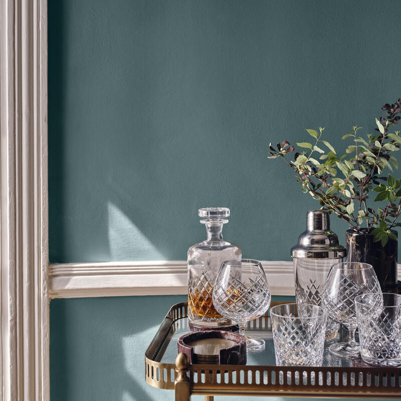
'This would highlight shadows, make the area feel flat, and exaggerate dullness. What you really need is a colour that works with the darkness, like a pigment-rich aubergine or navy. It absorbs the shadows, bringing character and drama.'
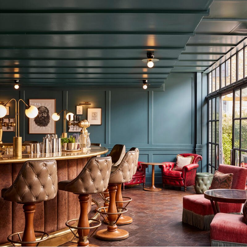
Consider the ceiling
'If you're going dark, make sure you do it right by considering all elements of the room,' says Bradley. 'Don't forget about the ceiling and default to that bright white lid.
'Our eyes will always be drawn to the lightest part of a room. So, a rich, beautiful colour on the walls topped with a white ceiling immediately loses its confidence. Try and either wrap the colour all the way around, which looks amazing in a smaller room, or if you're worried this will be too heavy, pair with a complementary, softer colour. A nice match is Purple 03 DUMBO House with Taupe 03 Soho Roc House.'
Use a complementary tone
'Ease yourself into using dark shades by creating a multi-tone scheme for the room, so that all of the emphasis doesn't hang on one dramatic colour. Our Soho House edit of paint colours is split into darker and mid to light tones, and all have been designed to work together, which makes this easier,' says Bramley.
'Some great schemes to try include Purple 03 DUMBO House with Pink 13 Nashville House, Teal 03 76 Dean Street with Greige 02 Soho Warehouse, and Green 05 Rome House with Taupe 03 Soho Roc House. Have some fun with it - paint alcoves, ceilings, door frames or even murals.'

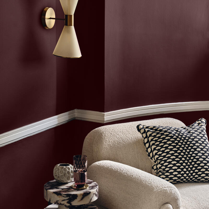
Choose contrasting furnishings
'A good tip when planning a dark room is to look at how this will pair with lighter furnishings. For example, a kitchen with existing light cabinets and countertops is perfect - a dark colour will balance and transform the space,' explains Bramley.
'Or, in a bedroom, it might be a lovely, warm oatmeal headboard with deep walls. In a dining room, there might be a light wooden floor and neutral dining chairs, contrasting then with dark walls. It's all about creating harmony and giving the room space to breathe.'
Elevate a space with black
'Black is a such a bold choice that clients worry it won't be easy to pull off, but it's actually much more forgiving than you think. The effect is stunning - it's elegant and looks beautiful on the walls,' says Bradley.
'Other ways you can use it could be on the ceiling and then drop into greige. Or for a more subtle effect, try it to accent woodwork or go for a statement black staircase. An instant hit is also in the kitchen with antique brass finishes - this looks amazing.
'In terms of what to avoid, I'd dissuade clients from painting the floor black as it's so hard to maintain. It shows dirt, marks and stains. Oh, and if you're painting a wall black, always bring it right down to the floor and don't leave the skirting white.'