
By Chloe Lawrance
The interior design of each of our Houses pays homage to its surroundings, with cues taken from the local culture and unique building history. There's also a common design language that unites every House. Part of this is the bold use of pattern and colour, spotted across our Houses globally to create warm, cosy and inviting spaces.
"In Soho House Barcelona, colour has been used in a playful manner to add personality," explains Lead Designer Lucy Packard, "Multi-coloured patterns are layered with tactile fabrics to create a cohesive overall aesthetic, heroing hues seen during the golden hour of sunset in the Mediterranean; burnt oranges, ochre yellows, and soft blues."
Over in the US, the bold use of pattern in Soho House Nashville takes inspiration from the city's musical heritage. "Throughout the House we juxtaposed strong, monochromatic patterns against softer florals and rich velvets, inspired by the history of the May Hosiery Mill where the House is situated and Nashville as Music City," explains Lead Designer Harriet Liley.
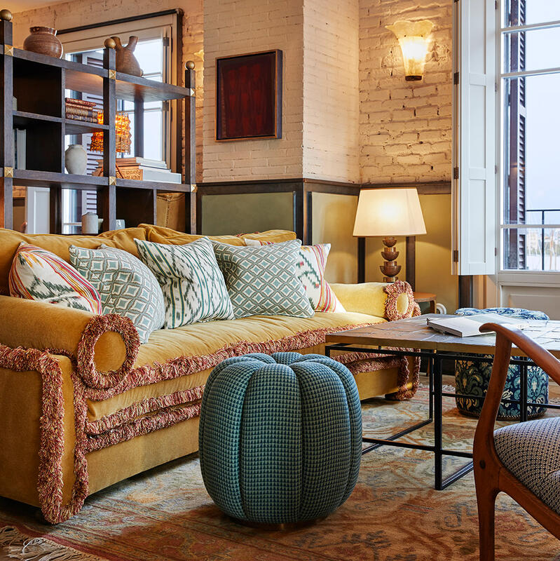

Our newest collection takes inspiration from the Houses to reimagine pattern with a confident but playful approach. In this collection, Soho Home favourites are reimagined as bold accent pieces that can be layered up or stand alone.
The Ashford sofa, elevated with a bold blue ikat stripe pattern, becomes the focal point of the living room. The classic Manette bed, as seen at Kettners, is given a new, modern look, created through a woven ochre dotted stripe. The newly upholstered Molina Dining Chair - which is found throughout our dining spaces across the globe, from High Road House to Soho House Berlin - juxtaposes solid velvet with playful pattern.

Mixing and matching patterns
"A good starting point is to find one 'anchor' pattern you really love, which incorporates a few colours," says Packard, "You can then layer out patterns or block colours which pull from these tones.
"Mixing scale and type of pattern is also important. Consider your anchor pattern type; is it abstract, floral, geometric, a stripe? Generally, you don't want too many of the same type of patterns in a single space. Layering different types of pattern with some plain block colours and textures helps to achieve balance."


Using colour playfully
"Colour brings energy to a room. For example, if you want a dining room to feel bright and welcoming, use reds, oranges and yellows. More calming spaces should lean towards blues and greens, or desaturated tones" says Danielle Vourlas, Director of Soho House Design ‑ North America.
"To mix colours, begin with a scheme of three you like," suggests Liley, "Use different tones and saturations of those three initial shades to add depth to your scheme. We try to avoid using too many primary colours in a scheme; instead think about secondary colours such as greens or pinks, as well as tertiary colours such as rusts and teals."

Designing a smaller space
"In smaller spaces, focus on smaller scale patterns, or use a mix of scales but keep them to small elements within the room - like accessories," says Liley, "Applying a pattern to a chair can create a focal point in a smaller room - just keep the rest of the space very calm."


Shop our new collection


Ashford Three Seater Sofa, Ikat Stripe, Olive
£6,995
Regular
£5,946
Member
Made-to-order


Telde Rug
from £1,095
Regular
from £931
Member


Abel Armchair, Dotted Stripe Weave, Ochre
£2,995
Regular
£2,546
Member


Lando Cushion
£215
Regular
£183
Member


Allier Rug
from £1,095
Regular
from £931
Member


Theodore Armchair, Vende Jacquard
£1,295
Regular
£1,101
Member


Pair of Molina Armless Dining Chairs, Paxton, Velvet, Grey Blue
£1,750
Regular
£1,488
Member


Vende Cushion
£225
Regular
£191
Member


Pair of Molina Armless Dining Chairs, Kimono, Velvet, Lichen
£1,750
Regular
£1,488
Member